此文写在 2021 年,R 以及 R 包版本更新可能会导致失效,现在建议用 ggbreak 这个包实现 (https://cran.r-project.org/web/packages/ggbreak/vignettes/ggbreak.html)
用 R 画图的时候,如果 y 轴存在个别非常大或非常小的值,或者当中的数值存在非常大差异的时候,画出的图很容易产生误导效果,使人忽略当中某一部分信息。
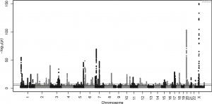
比如,下面这张 GWAS 曼哈顿图中(来自https://doi.org/10.1371/journal.pgen.1006594.g001 ),y 轴的值是由每一个 SNP 进行关联分析算出的 p 值再进行 -log10(P) 转换后得到的。图中存在非常多显著的 SNPs,当中最显著的 -log10(P) 甚至达到了 150 左右。不过,这样画图的话,红线附近会有很多显著的 SNPs 会因为 y 轴太大而显得不怎么显著。
![图片[1]-R画图y轴范围太大时,如何局部压缩坐标轴? --实验盒](https://www.shiyanhe.com/wp-content/uploads/2021/03/image20210321163630.png)
针对这种 y 轴范围太大、有一部分点与其他点差距非常大的情况,可以考虑压缩/压扁 y 轴。删除 y 轴中没有点的部分也是可以,但个人更倾向于直接对 y 轴进行缩放,把偏离比较大的区域压扁。
RPub 上有一篇文章介绍了一个缩放的函数(https://rpubs.com/huanfaChen/squash_remove_y_axix_ggplot)
,但当中有个小问题。这里小修改了一下。
首先生成一个示例数据,直接用 ggplot2 画图:
library(ggplot2)

shiyanhe <- data.frame(group=rep(c('A', 'B', 'C', 'D'), each = 10),
                 value=c(rnorm(10), rnorm(10)+100))

ggplot(shiyanhe, aes(x=group, y=value)) + geom_point()
得到的图是这样的,不同组别的值差别非常大,y 轴范围很大:
![图片[2]-R画图y轴范围太大时,如何局部压缩坐标轴? --实验盒](https://www.shiyanhe.com/wp-content/uploads/2021/03/image20210321165542.png)
接下来构建一个 squash_axis 函数来实现坐标轴压缩功能,这个函数需要使用 scales 包:
library(scales)

squash_axis <- function(from, to, factor) {
    # Args:
    #   from: left end of the axis
    #   to: right end of the axis
    #   factor: the compression factor of the range [from, to]

  trans <- function(x) {
      # get indices for the relevant regions
      isq <- x > from & x < to
      ito <- x >= to

      # apply transformation
      x[isq] <- from + (x[isq] - from)/factor
      x[ito] <- from + (to - from)/factor + (x[ito] - to)

      return(x)
  }

  inv <- function(x) {
      # get indices for the relevant regions
      isq <- x > from & x < from + (to - from)/factor
      ito <- x >= from + (to - from)/factor

      # apply transformation
      x[isq] <- from + (x[isq] - from) * factor
      x[ito] <- to + (x[ito] - (from + (to - from)/factor))

      return(x)
  }

# return the transformation
  return(trans_new("squash_axis", trans, inv))
}
然后就可以在 ggplot 画图时的 coord_trans 使用这个函数。参数 from 和 to 是要压缩的范围, factor 是要压缩的倍率。比如要把 5 到 95 范围的 y 轴压缩 10倍:
ggplot(shiyanhe, aes(x=group, y = value))+
  geom_point()+
  coord_trans(y = squash_axis(5, 95, 10))
这样画出的图,就能看清每个组别中各个点的分布:
![图片[3]-R画图y轴范围太大时,如何局部压缩坐标轴? --实验盒](https://www.shiyanhe.com/wp-content/uploads/2021/03/Pasted-image-20210321170306.png)
把 1 到 99 范围的 y 轴压缩 30 倍:
ggplot(shiyanhe, aes(x=group, y = value))+
  geom_point()+
coord_trans(y = squash_axis(1, 99, 30))![图片[4]-R画图y轴范围太大时,如何局部压缩坐标轴? --实验盒](https://www.shiyanhe.com/wp-content/uploads/2021/03/image20210321172029.png)
备注
注意,参考的 Rpub 原文使用 scale_y_continuous()进行转换:
ggplot(shiyanhe, aes(x=group,y=value))+
  geom_point()+
  scale_y_continuous(trans = squash_axis(5, 95, 10))
然而这样操作会报错:
ERROR while rich displaying an object: Error in x[isq] <- from + (x[isq] - from) * factor: NAs are not allowed in subscripted assignments使用 coord_trans 的话,就可以画出图。
参考
- https://rpubs.com/huanfaChen/squash_remove_y_axix_ggplot
- https://stackoverflow.com/questions/61010786/error-nas-are-not-allowed-in-subscripted-assignments-while-using-squash-axis-i
![图片[5]-R画图y轴范围太大时,如何局部压缩坐标轴? --实验盒](https://www.shiyanhe.com/wp-content/uploads/2020/11/wx-banner-website.jpg)


暂无评论内容